Brand Identity
One of the challenges with subsidiary branding is creating a cohesive brand strategy that adheres to corporate standards while also preserving the integrity and individuality of the brand built by the subsidiary. In the case of Toolbox.com, the red toolbox in their logo is at the heart of their brand identity, and we knew that no matter what else changed, that iconography needed to be at the center of the new brand campaign.
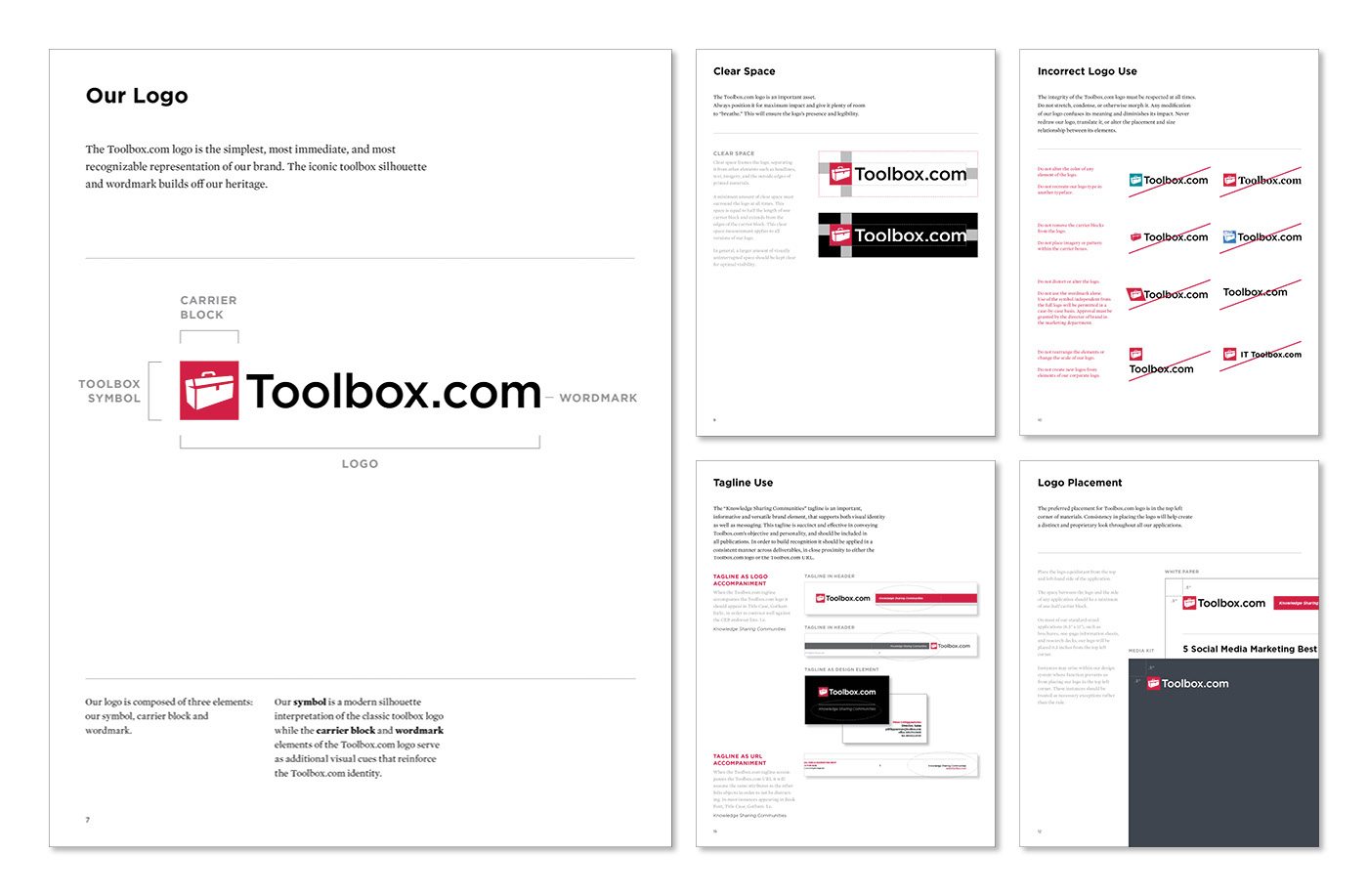
The new iteration of the iconic toolbox silhouette builds off the Toolbox.com heritage, while the carrier block and wordmark ties the logo to the Corporate Executive Board. The new logo and the brand elements were rolled out to Toolbox.com's more than 2.2 million IT, HR and finance members and nearly 250 active advertising customers.
The new iteration of the iconic toolbox silhouette builds off the Toolbox.com heritage, while the carrier block and wordmark ties the logo to the Corporate Executive Board. The new logo and the brand elements were rolled out to Toolbox.com's more than 2.2 million IT, HR and finance members and nearly 250 active advertising customers.
Logo Redesign

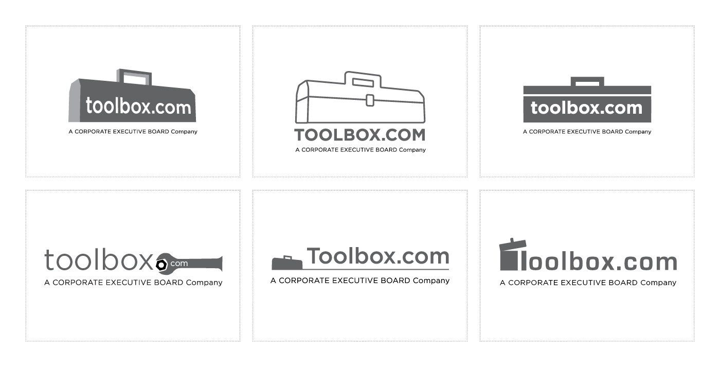
Creative Exploration
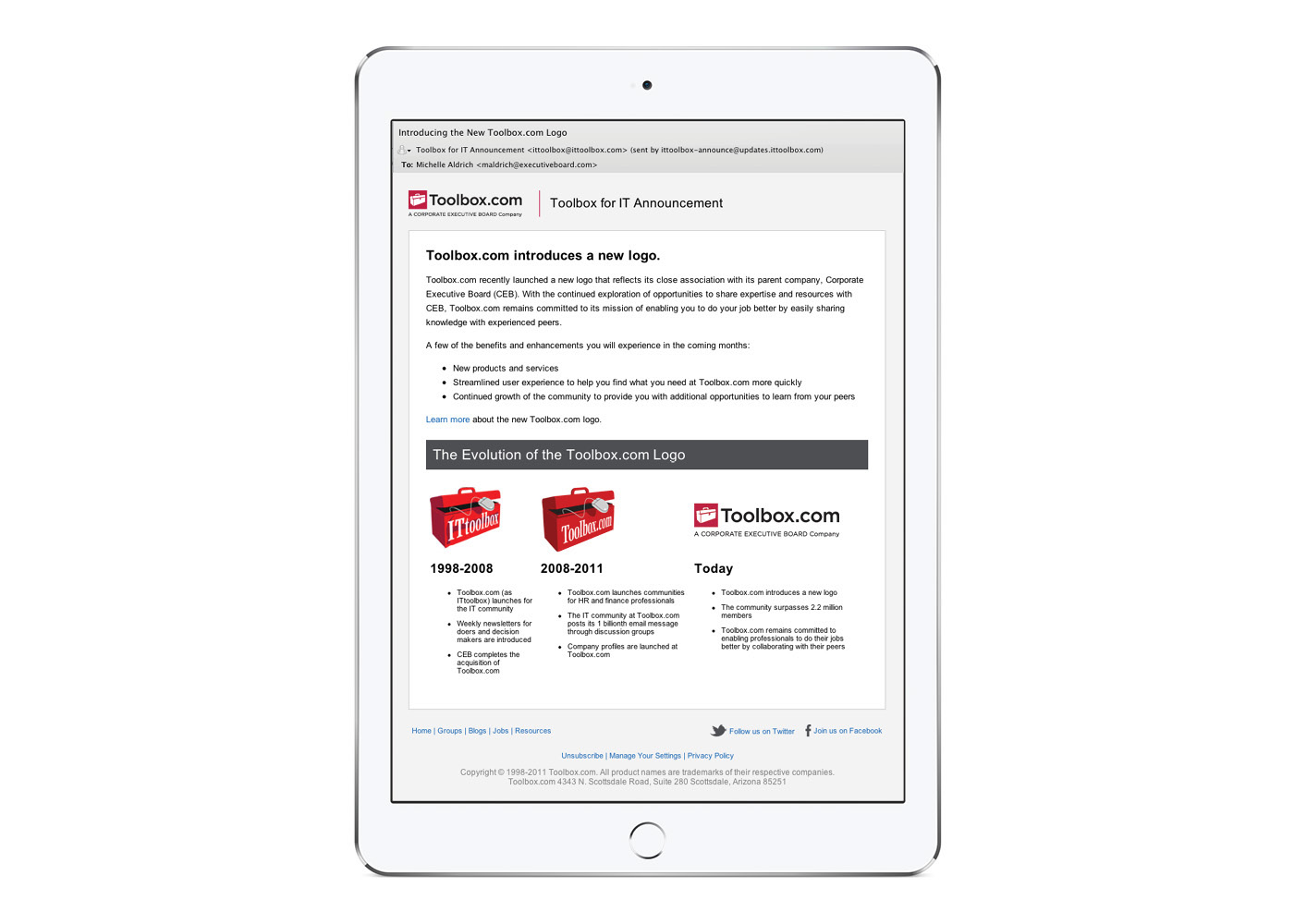
Rebrand Communication
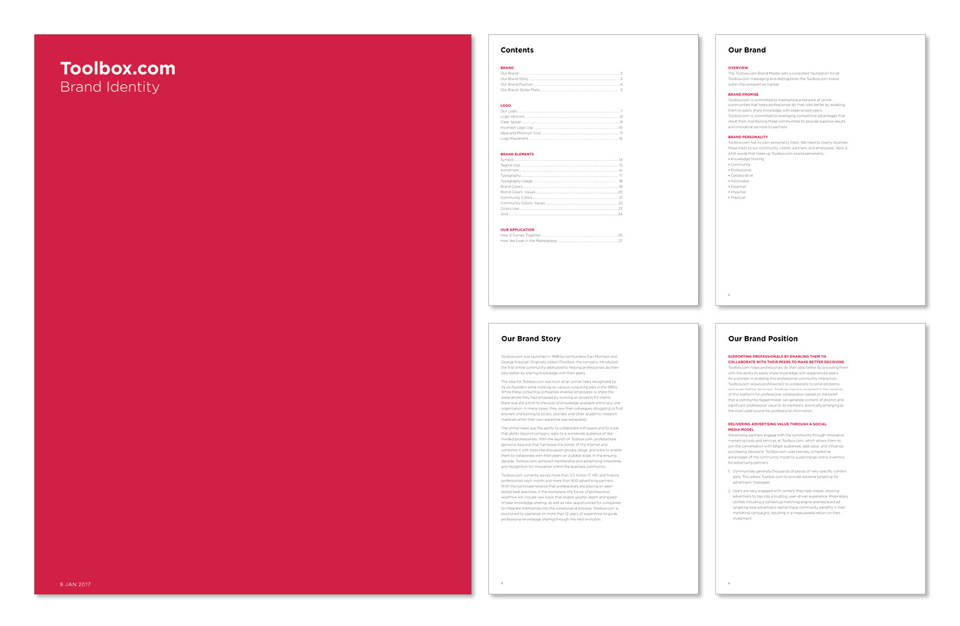
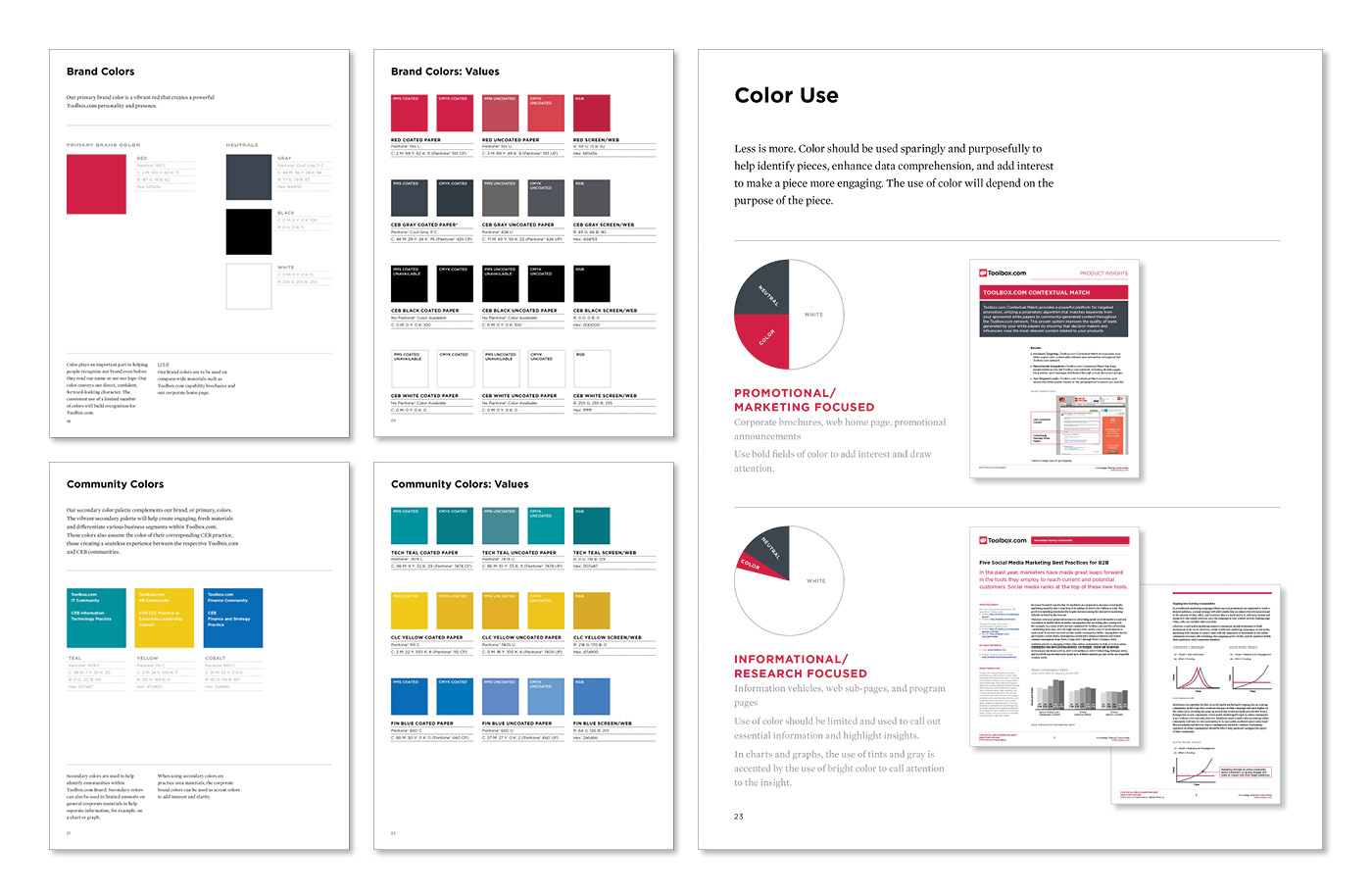
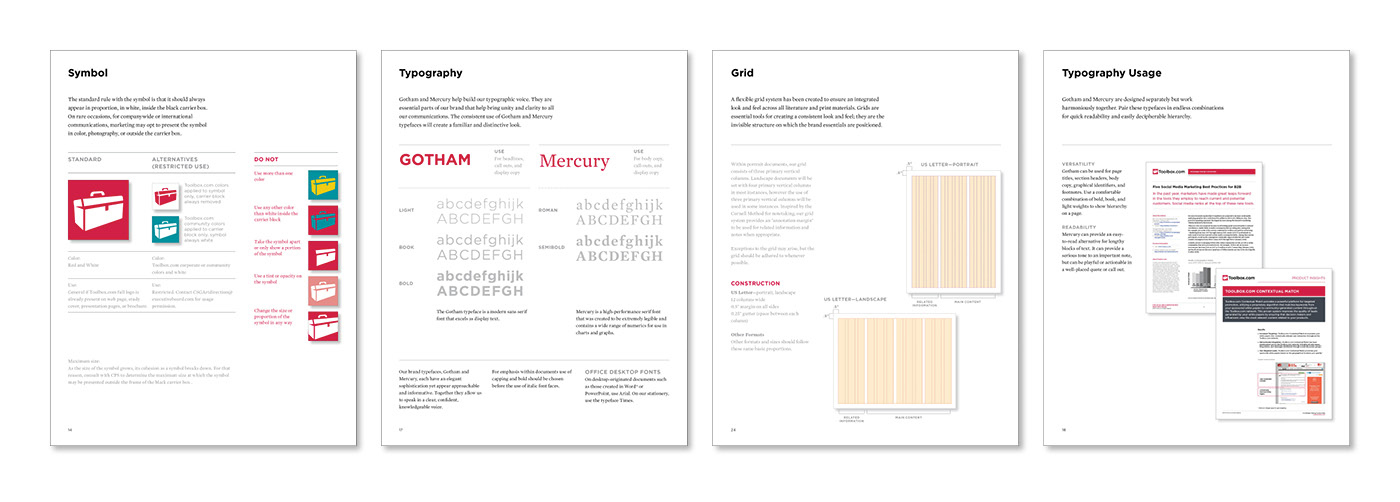
Brand Guidelines
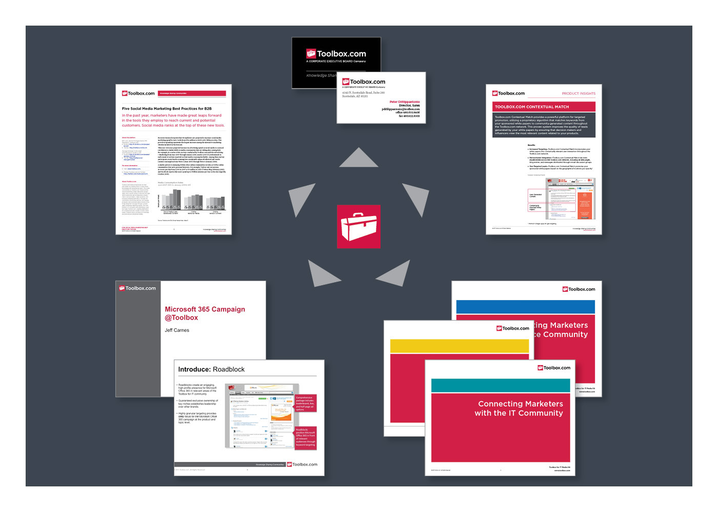
Collateral System
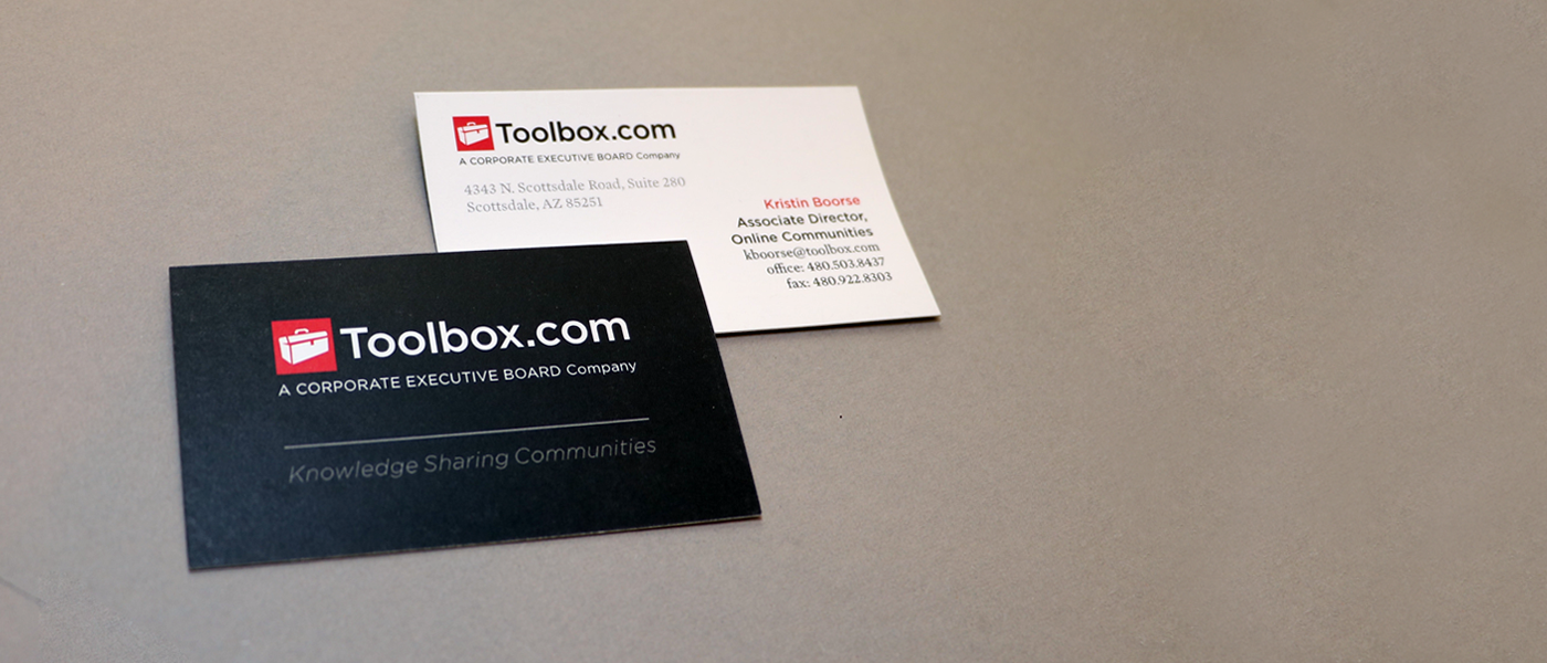
Business Cards
CONTRIBUTORS
Strategy, Project/Account Mangement, Art Direction: Michelle Hussain
Graphic Designers: Jason Dreyer, Mimi Jung, Vivek Dyundi